For our first wedding design post, let’s start with the basics and discuss the elements and principles of design.
As a graphic designer, this was the first thing I learned in school, and it’s relevant to any design field-- including event design.
The elements of design are the pieces that make up design. There are six elements:
Color: light reflected off objects.
Line: a mark with greater length than width
Shape: a closed line. Shapes are flat.
Form: a 3-D shape
Texture: surface quality that can be seen or felt
Space: the area between or around objects.
The principles of design are how the elements are used together to make a complete piece of work. Let’s look at real wedding images to help define some of the more prominent principles:
1. Balance: the distribution of the visual weight of objects, colors, texture, and space. Here, balance is created with the long rectangular tables, paired with the smaller round tables.
Photo by Olivia Jacob
2. Proportion: when all parts of design (size, number) relate well to each other. At this wedding, the tall floral arrangements fill the space between the tabletops and the ceiling, giving the room and decor a sense of proportion to each other.
Photo by Charles Archambault
3. Emphasis: the part of a design that catches your attention. At Julia and Phil’s wedding the white globe lanterns are the largest piece of design and immediately draw your eye up into the reception space.
Photo by De Neuva Photography
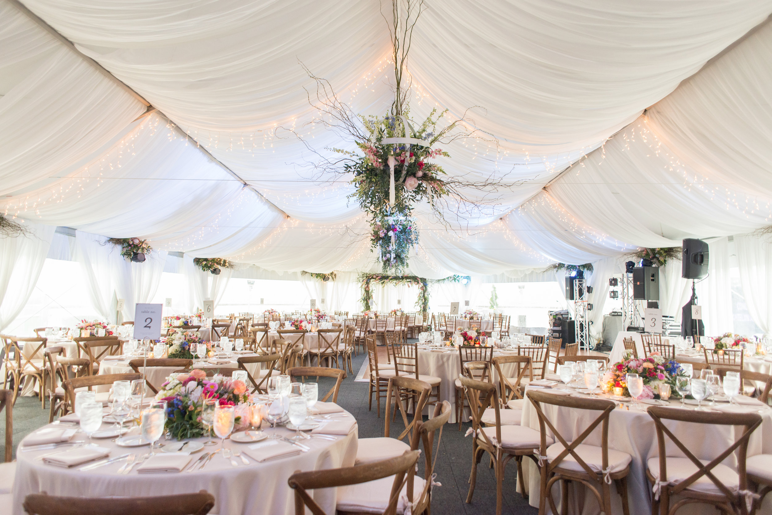
4. Movement: the path your eye takes around a design or space. At Katelyn and Matt’s wedding their florist added bunches of flowers at the top of each column in the tent and floral globes at the peak of the ceiling. This helps guide your eye around the entire reception space.
Photo by Jessica Latos Photography
5. Repetition: when an object is repeated. This can create patterns and help the design feel cohesive. At Nisha and Derek’s wedding, their custom table runners were placed at every table, creating a pattern and making the room feel cohesive. The string lighting is also an example of repetition in the space.
Photo by Photo Lady Love
6. Variety: the use of several elements to hold your attention and guide your eye. This wedding incorporated plenty of variety! They’ve woven together many complementary colors, different style plates, and mismatched chairs. It adds interest and personality.
Photo by De Neuva Photography
7. Unity: a feeling of harmony between all parts of a design, which creates a sense of wholeness. At this wedding, they chose a neutral palette of tans and greens. The burlap tablecloths paired with tins of garden-like greenery create a cohesive modern-rustic look that doesn’t feel overdone.
Photo by Amber Wilke
There are many different ways to incorporate design principles into your wedding, so don’t be overwhelmed! Just being aware of them will help you better communicate your design vision to your vendors. But, if you’re still not confident you can execute your design vision on your own, check out The Plannery’s design services. We’d love to help!
Our next post will dive into everyone’s most discussed element of design: color!


