event design

How to Design Your Wedding

How to Design Your Wedding

Many of you know I brought Kim on board to handle event design services for our clients who wanted some help in that arena. What you may not know is that I did it because I couldn’t! Like many of you, I’m intimidated as hell by it! And yet. I think while many of us feel intimidated by wedding design or “styling” (ugh), we also actually do want our event to have a cohesive look and feel. But we have no idea how to do that. Frankly, many of our clients come to us a bit late - and so I wanted to discuss when in the planning process you should start integrating design. Especially for you newly engaged folks, it’s worth a read so that you’re able to be cohesive without having to overthink things too much.

Wedding Design begins with the venue… or does it?

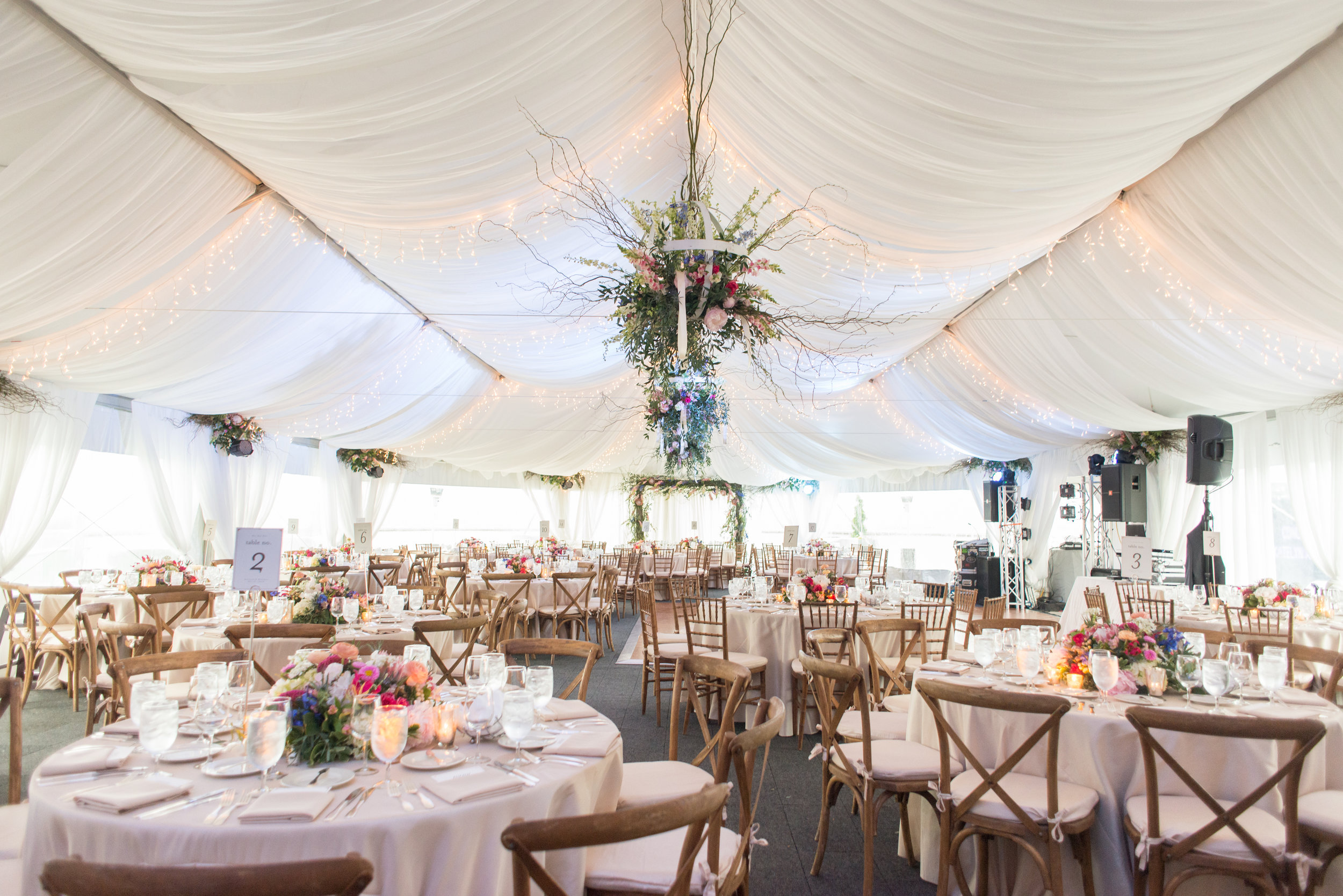
Photo by JPG Photography

Photo by JPG Photography

Which comes first, the design or the venue? It’s sort of a chicken or the egg question, depending on who you are. So our first tip is to make note of how much the design/style of your wedding really matters to you. If you are a design fanatic and have strong opinions about what your wedding looks like, start with design first. As in, if you HAVE to have a rustic feel, then you probably shouldn’t check out city venues. However, most of my clients lean more towards the “we care, but it’s not our top priority” realm. So for you, we recommend you book your venue and date first. The location and the season of your wedding will strongly influence your event design. Once the venue is booked, it’s worth stopping a moment and thinking about the design elements so that your wedding can have a cohesive feel. (side note: this is where our design services can really help, once you’re at this point. Kim talks and meets with you to help you determine the following items: colors, and a mood board with which to make all future decisions!)

Wedding colors

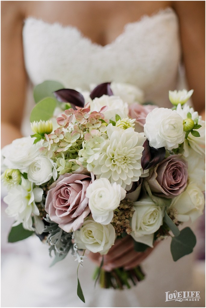
Photo by Modern Frame Photography

Photo by Modern Frame Photography

From there, use your venue to think about the colors and feel you want for your wedding. If you’re having a beach wedding you might opt towards sandy and romantic tones - or perhaps it’s a beach in Mexico and you want to go for bold colors! Kim adds, color is SO personal and much more than just saying to your vendors you like the color pink. What kind of pink? How much pink? Only pink, or other colors as well? Being super clear about particular shades and accent colors will help guid your vendors as they make proposals for you. The season also matters - though I’m a fan of not sticking to seasonal colors to mix things up a bit! If the season inspires you - for example, you’ll be wearing a long sleeved dress for a winter wedding - use that inspiration towards other colors and elements.

Wedding Mood Board

Wedding Mood Board

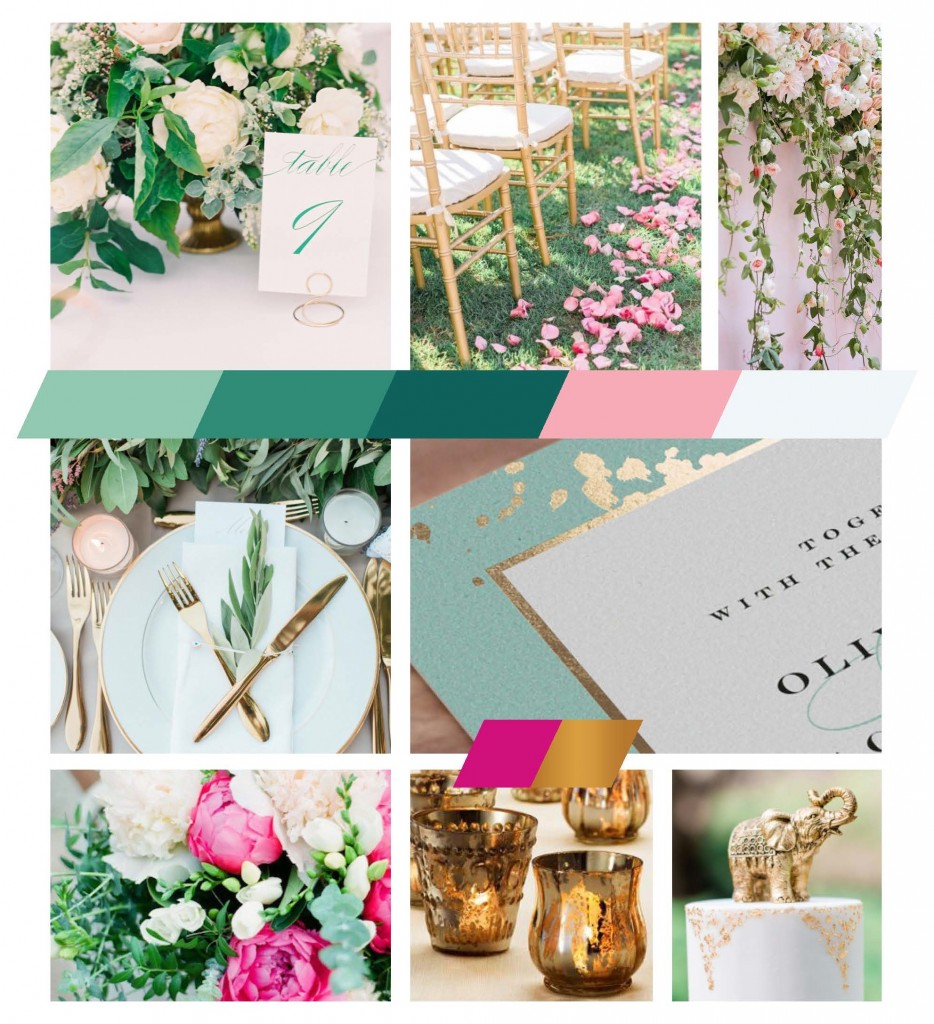
You should then use all of the above to make a mood board. Yes, Pinterest is a great place to start browsing and collecting images that speak to you - but too many images can muddle your vision and confuse vendors. That’s when a streamlined and edited down one-page mood board can do wonders - and where we come in to help! Editing your own thoughts is hard. When you meet with Kim you’ll discuss everything on your mind design-wise and she’ll help narrow down your vision to one that is cohesive for your vendors to work from. This is where I would have killed for Kim’s assistance back in the day of planning my own wedding. Style and design are such visual elements. Talking about them to vendors sometimes…just doesn’t work. But having that streamlined mood board to SHOW your caterer so they can help you pick the linens is a priceless tool. Or SHOW your florist what type of bouquet you’re interested in. This mood board can be a wonderful resource for ALL the future design choices down the planning pike.

But I don’t care about Wedding Design so it doesn’t matter

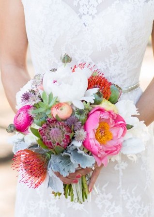
Photo by Porter Watkins

Photo by Porter Watkins

Don't think you have design choices to make? Unfortunately, you’re wrong. Even if, like me, you don’t consider yourself someone who is sensitive or interested in design, there are lots of moments throughout the planning process when small decisions you make can help determine how cohesive your wedding will feel.

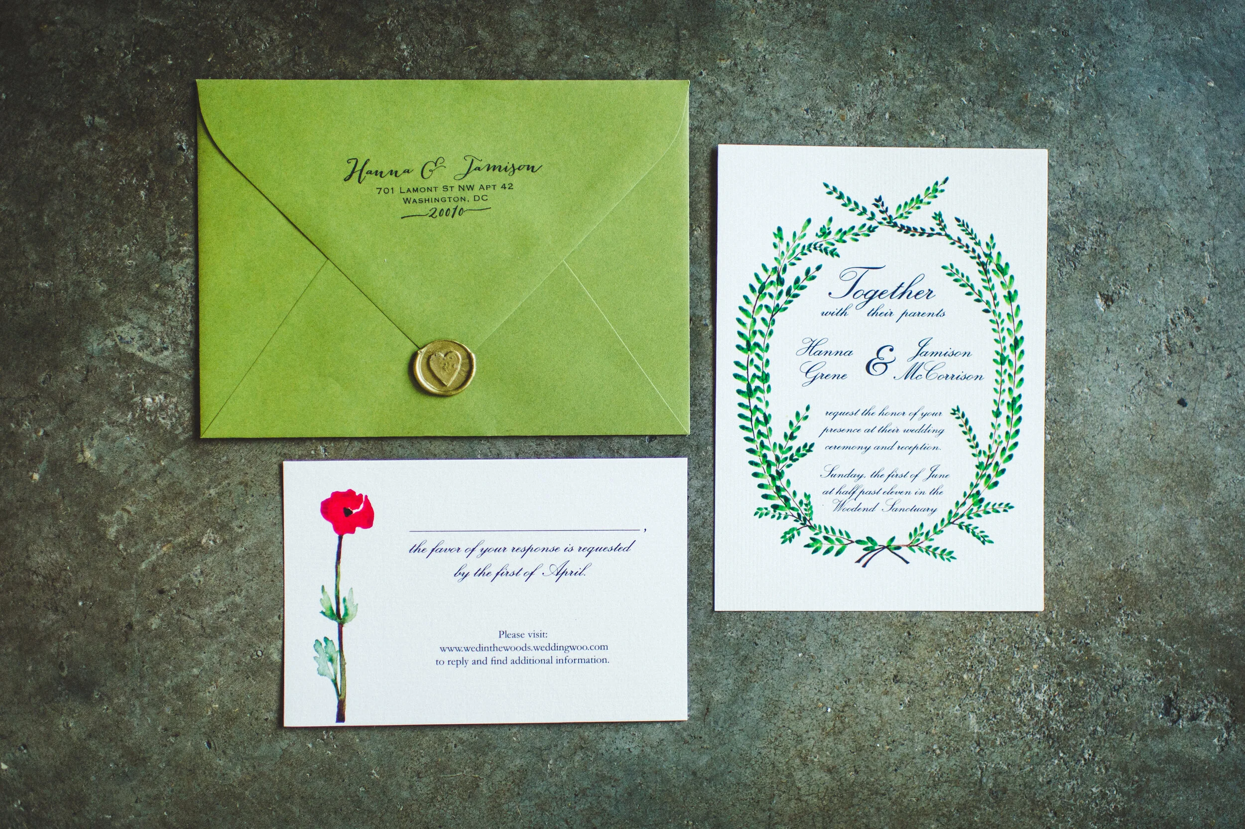
The reason we recommend you start thinking about these things early on is so your wedding website, your save the dates, and then all future correspondence and communication with the guests feels cohesive. Design helps communicate a message to everyone involved - and the practical, logistics-driven person in me adores that element of design: the story it tells and communicates to your guests (which, as a reminder, I believe communication is the #1 key to having a stress free wedding. So mull that over for a bit). Giving guests a clear sense of what to expect, not only in text on your website, and alphabetizing your escort cards, but in the look and feel of your invites, wedding website, and other design elements, help them feel more comfortable and at ease.

The Plannery Event Design - from inception to reality

JJ-BeforeAfter.jpg

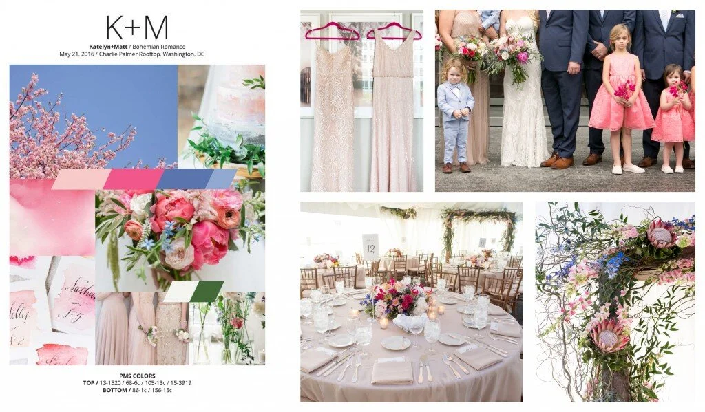
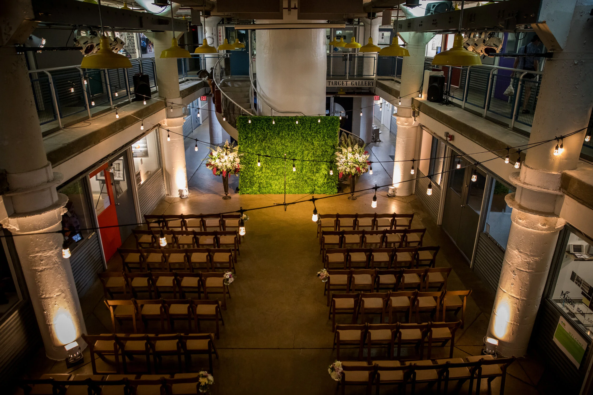
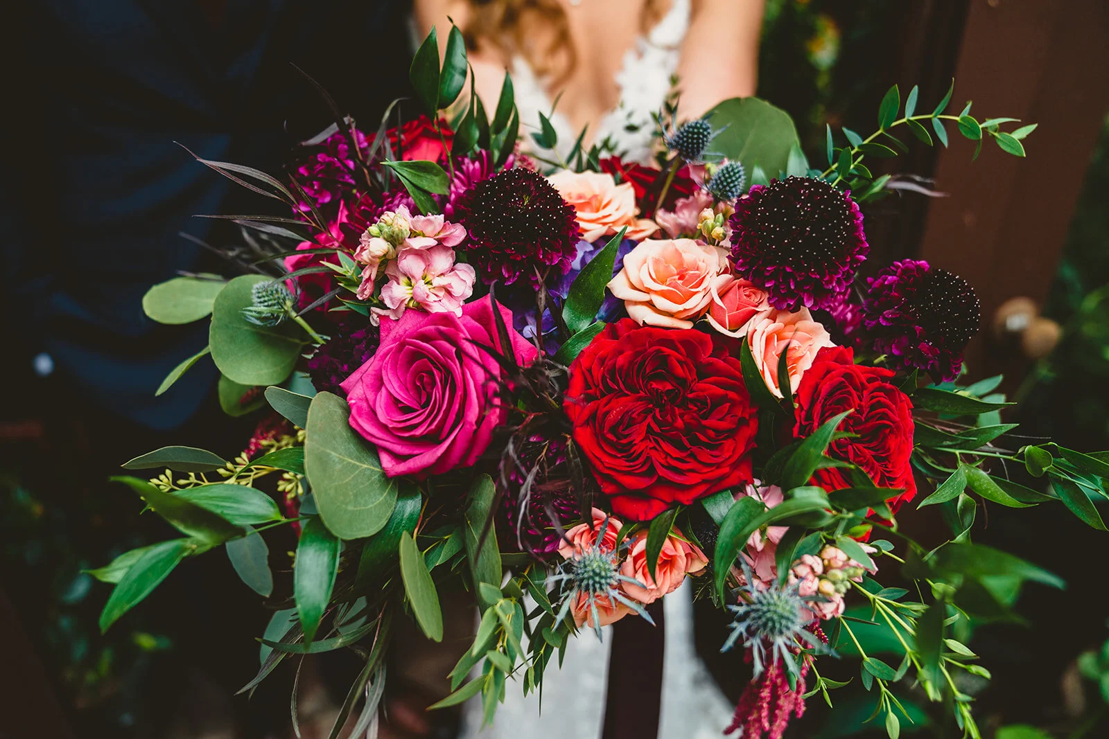
We’ve previously showed you some examples of how our event design services go from mood board, to action and reality. We have another one to show you this week, from Janine and Jenevieve’s wedding at The Torpedo Factory. Janine and Jenevieve loved how unique the Torpedo Factory was and wanted to play on that artsy vibe. They liked how modern the factory felt, and that it housed actual working art spaces, so Kim incorporated some of those feelings into the imagery in the moodboard. They both loved purples and blues but also wanted to add a warmer color for contrast. Lastly, they were really into playing up the lighting in the space, and wanted a more organic flower style that incorporated several colors. 

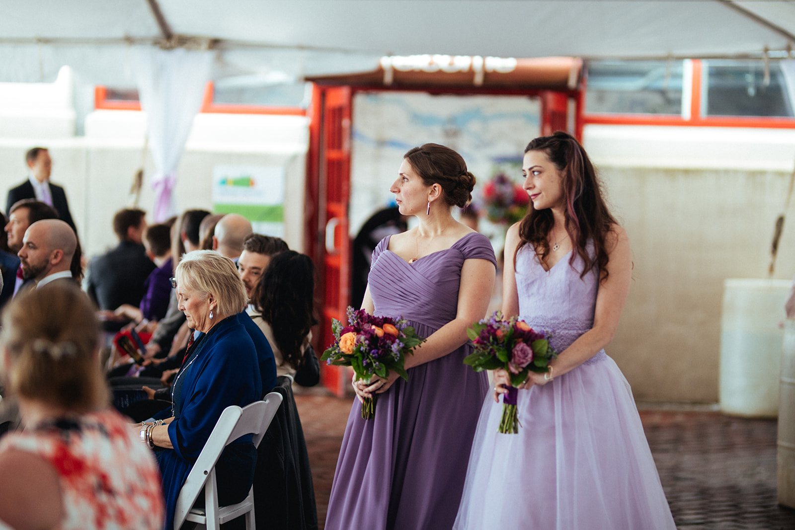
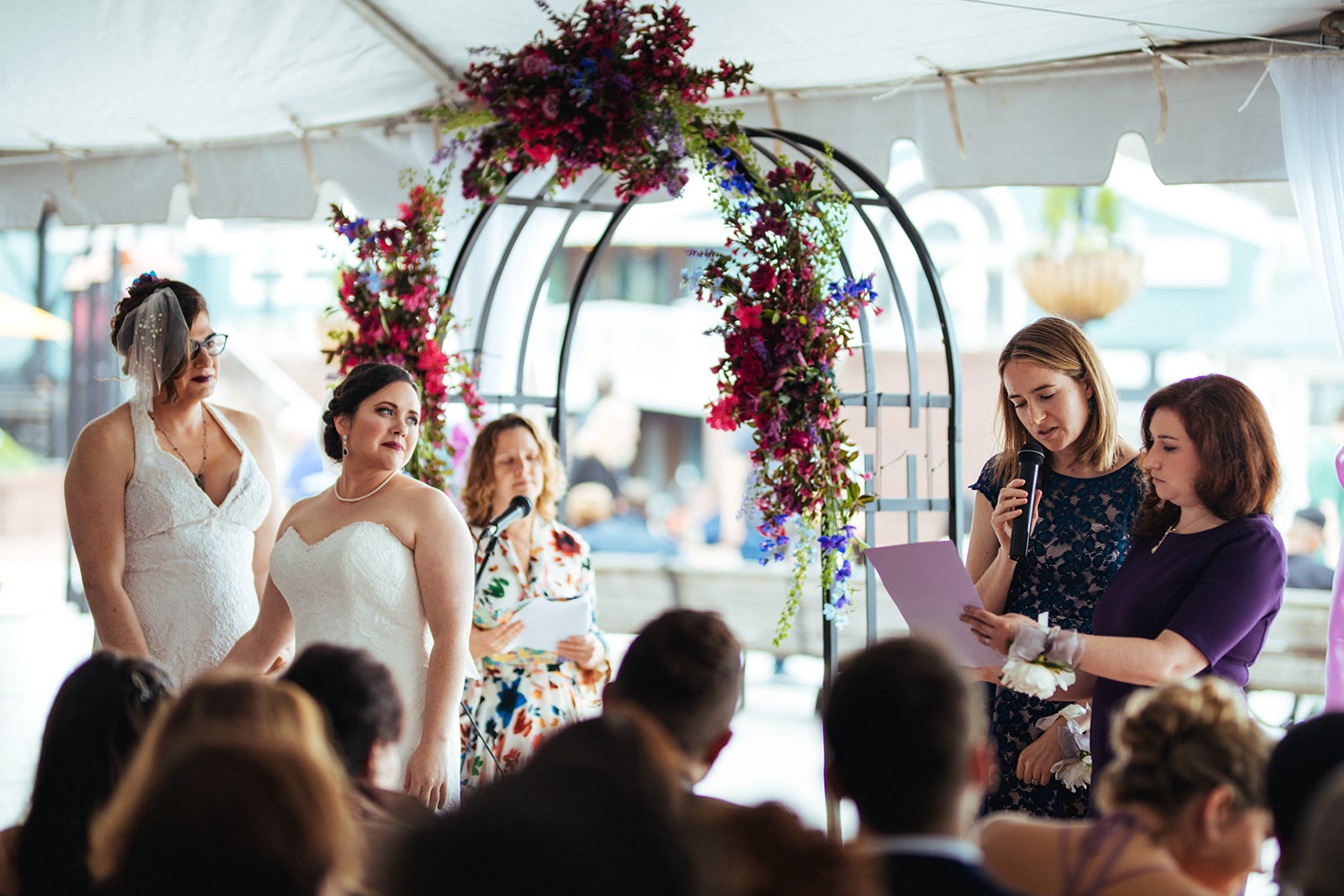
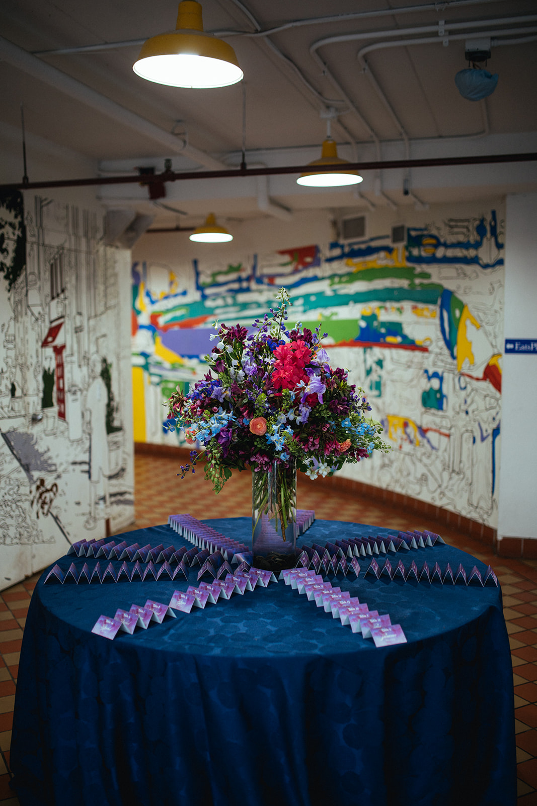
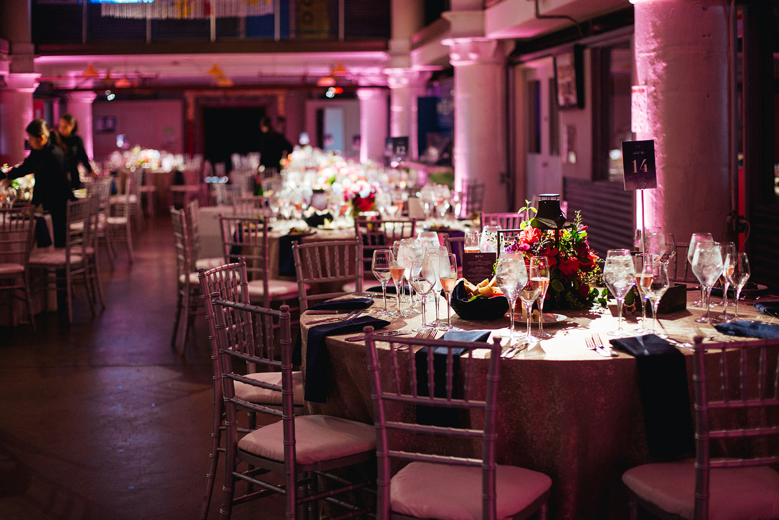
As you can see, the florist took this mood board and created lush, romantic, organic pink and purple flower arrangements, both for the ceremony and the centerpieces. We incorporated candles, darker lighting, and pink uplighting to bring a romantic feel to the space. They also took the artsy vibe of the venue - the painting/brush stroke element in the mood board - and brought that into their printed materials (like their escort cards, pictured here), and also used romantic cursive writing. Finally, their family and wedding party wore shades of purple as well, to tie in with their color theme.

Hopefully this side by side comparison, as well as some other photos below help to give you a sense of how this mood board can be a real guide to execute a look and feel for your day! You can learn more about our design services here!

Photos by Shawnee Custalow

How to Pick Your Wedding Colors

Arguably the most prominent element of design is color. It’s what most design clients want help with—whether it’s choosing a main color, or making sure secondary colors work together with the main color to create a mood or feeling.

With so many colors it can be hard to know where to start when trying to decide on a color scheme. Here are a few of the questions I would ask at a design consultation to help narrow down colors:

What kind of mood do you want to set at your wedding? Casual, glamorous, playful, fun?

Have you already chosen our venue? What does it look like, and what colors are already there?

What colors are you most drawn to?

What colors are you least drawn to?

What season is your wedding taking place?


What colors are brought about in your mind after answering these questions? Color is a very personal and unique experience—no color combination is inherently wrong. Of course, some colors clash when used together, and some are displeasing to the eye, but it’s ALL personal preference. So don’t overthink it!


There are many, many ways to mix and match colors. Without going too far into the nitty gritty details of color theory, let’s focus on these three attributes of color: hue, tints, and shades.

Hue: The main property of color. How we describe colors. Ie. red, orange, yellow, green, blue, purple, etc.

Tint: White is mixed with a hue.

Shade: Black is mixed with a hue.

Knowing this basic terminology will help you better communicate your color preference with your vendors. Which brings us to....

Why being specific about your color preference is important.

When talking with your vendors, it’s critical to be specific about the colors you want in your wedding. Just saying you want green and pink incorporated can mean different things to different vendors. Emerald green or spring green? Magenta or dusty pink? The more adjectives you use to describe your colors the better your vendors will be able to narrow down exactly what color you mean. Then, on your wedding day you won’t be surprised by a color you didn’t want included.

Remember, don’t overthink your color choices. If you like the combination, go for it and be specific when communicating it.

Happy color picking!

The Elements and Principles of Event Design

For our first wedding design post, let’s start with the basics and discuss the elements and principles of design.

As a graphic designer, this was the first thing I learned in school, and it’s relevant to any design field-- including event design.

The elements of design are the pieces that make up design. There are six elements:

  • Color: light reflected off objects.

  • Line: a mark with greater length than width

  • Shape: a closed line. Shapes are flat.

  • Form: a 3-D shape

  • Texture: surface quality that can be seen or felt

  • Space: the area between or around objects.


The principles of design are how the elements are used together to make a complete piece of work. Let’s look at real wedding images to help define some of the more prominent principles:

1. Balance: the distribution of the visual weight of objects, colors, texture, and space. Here, balance is created with the long rectangular tables, paired with the smaller round tables.  

Photo by Olivia Jacob

Photo by Olivia Jacob

2. Proportion: when all parts of design (size, number) relate well to each other. At this wedding, the tall floral arrangements fill the space between the tabletops and the ceiling, giving the room and decor a sense of proportion to each other.

Photo by Charles Archambault

Photo by Charles Archambault

3. Emphasis: the part of a design that catches your attention. At Julia and Phil’s wedding the white globe lanterns are the largest piece of design and immediately draw your eye up into the reception space.

Photo by De Neuva Photography

Photo by De Neuva Photography

4. Movement: the path your eye takes around a design or space. At Katelyn and Matt’s wedding their florist added bunches of flowers at the top of each column in the tent and floral globes at the peak of the ceiling. This helps guide your eye around the entire reception space.

Photo by Jessica Latos Photography

Photo by Jessica Latos Photography

5. Repetition: when an object is repeated. This can create patterns and help the design feel cohesive. At Nisha and Derek’s wedding, their custom table runners were placed at every table, creating a pattern and making the room feel cohesive. The string lighting is also an example of repetition in the space.

Photo by Photo Lady Love

Photo by Photo Lady Love

6. Variety: the use of several elements to hold your attention and guide your eye. This wedding incorporated plenty of variety! They’ve woven together many complementary colors, different style plates, and mismatched chairs. It adds interest and personality.

Photo by De Neuva Photography

Photo by De Neuva Photography

7. Unity: a feeling of harmony between all parts of a design, which creates a sense of wholeness. At this wedding, they chose a neutral palette of tans and greens. The burlap tablecloths paired with tins of garden-like greenery create a cohesive modern-rustic look that doesn’t feel overdone.

Photo by Amber Wilke

Photo by Amber Wilke

There are many different ways to incorporate design principles into your wedding, so don’t be overwhelmed! Just being aware of them will help you better communicate your design vision to your vendors. But, if you’re still not confident you can execute your design vision on your own, check out The Plannery’s design services. We’d love to help!

Our next post will dive into everyone’s most discussed element of design: color!

Event Design in Action

As many of you know we launched an event design branch at The Plannery recently. Ann and Stephen were one of our first test subjects (!), so I thought it would be fun to take a look at how their moodboard from Kim came to life. Ann and Stephen wanted a colorful, modern wedding to fit in with their somewhat unique venue, Clarendon Ballroom. Kim came back to them with some beautiful bold colors in various shades of pink along with a deep blue, and accented by gold and green. As you'll see, Ann's bridesmaids dresses played into the darker pink tone, while her florist brought out the brighter pinks and green accents. We went with the dark blue linens which perfectly matched Kim's design board - as did Stephen's suit! The gold chairs, and gold table numbers were great gold accents - and though we didn't get photos of it, they served sparkling rose to their guests pre ceremony!

Please be sure to ask us about our design services whether you're a coordination or planning client!

Photo by Shandi Wallace

Photo by Shandi Wallace

Photo by Shandi Wallace

Photo by Shandi Wallace

Announcing - Event Design with The Plannery!

ND-moodboard-v3edit Event design is coming to The Plannery!

Many of you know that ever since the beginning, I have always viewed myself as a logistics-only person. While I do think I have a fairly good eye, and I've obviously learned a lot over my years of planning weddings about what works well and what doesn't, I have never studied design. I often get the question from potential clients as to whether I also do event design. And that answer, for a long time, was "no." Not considering myself anything close to an expert in the area of design, I've never felt comfortable calling myself an event designer. But I was disappointed that I couldn't provide those services to my clients.

And then Kim came along. I actually coordinated Kim's wedding. She was awesome to work with, and did some amazing DIY design pieces for her own wedding (see here). She reached out to me post-wedding to express her interest in partnering with The Plannery. She, unlike me, is an actual designer. As in, she holds a B.A. in Media Arts and Design and is a full time graphic designer - she therefore has a killer eye and is great at creating cohesive visual plans for event design.

As many of my current clients know, we've been testing out the relationship and the process this past year. Slowly rolling it out to see what works and what doesn't, and whether clients were even interested!

And so I'm thrilled to finally announce that The Plannery will officially be offering some great add-on packages to our current services to those interested in event design assistance. Many of my clients are very hands-on, but find they want resources and assistance to narrow down decisions. We're taking that same approach for event design and I'm really excited to offer my clients these new design options! More info is on our website now, and we'll be doing a series of blog posts this week to tell you more, including hearing from Kim herself and more details on the services!


Save

Save

Save